


Choosing paint colors can transform a space, giving it the ambiance and personality you envision.
However, the process can often be overwhelming, with thousands of shades, hues, and finishes available.
Whether you are painting your home, office, or commercial space, choosing the perfect color more quickly and easily is essential to staying on schedule and avoiding stress.
This guide will walk you through the step-by-step process of choosing paint colors that suit your needs more quickly and easily without losing time or getting overwhelmed.
Why Selecting Paint Color Can Be Overwhelming
Before we go into how to choose paint color fully, you must understand why it can be so overwhelming in the first place.
Here are a few reasons to note.
- The Variety of Colors Available
With modern paint manufacturers like Spawd, who are offering an endless variety of shades, it’s easy to feel paralyzed by choice.
The sheer number of options can make narrowing down to a single color difficult.
- Impact of Color on Space
Paint colors significantly impact how a room feels. Whether you’re trying to create a serene atmosphere or an energizing environment, the color on the walls can set the tone right.
Meanwhile, making the wrong color decision can lead to frustration and additional expenses if you have to repaint.
- The Lighting Differences
Do you know colors look different in natural light versus artificial light? This can further complicate your decision-making process.
What looks perfect in the store may not look the same once you apply it to your walls.
- Emotional Influence
Colors can evoke different emotions, this is necessary in choosing hues that align with the mood you want to create in a particular room.
Here’s How to Choose a Paint Color More Quickly
1. Identify the Purpose of the Space You Want To Paint
Before choosing paint colors, you should first consider the purpose of the room or the space.
Every space serves a different function, so, your choice of paint color should support that.
Here’s a quick guide on how color can affect different rooms and spaces.
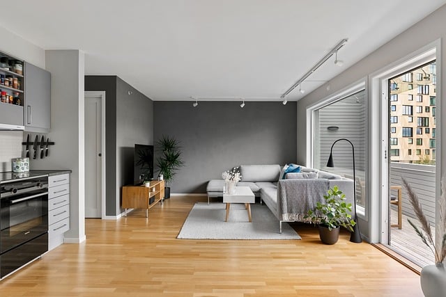
1. Living Room
When choosing living room colors, go for warm, welcoming colors like soft beige, warm gray, or light tan to create a cozy, and inviting atmosphere.
Avoid overly stimulating or overly cold colors unless you want a specific modern vibe.
2. Bedroom
The bedroom is a place of relaxation, so soothing colors like light blues, muted greens, or soft pastels are the perfect choice.
Avoid too bold and bright colors, they can create unnecessary energy, and this might disrupt your sleep sometimes.
3. Kitchen
Kitchens often benefit from bright, lively colors such as yellows, whites, or even light greens and light grays.
These colors create an energizing environment and often pair well with wooden cabinetry or sleek modern designs.
4. Office
For a productive office, neutral tones like white, gray, or beige will work best.
You can add a pop of color with accent walls in muted blues or greens to increase focus and concentration.
5. Bathroom
Bathrooms are often seen as a place of serenity. So soft blues, whites, and light grays are popular choices as they can promote cleanliness and calmness.
2. Use Color Psychology to Guide Your Choices
To make your choice quickly, make use of color psychology. Color psychology can significantly impact how a space feels.
Different colors evoke different emotions, and using the right hues can enhance the function of each room.
Here’s a quick overview of some common colors and their associations.
- Blue
Blue shades evoke calm, serene, and peacefulness. These hues are great for bedrooms, bathrooms, or study areas.
- Green
This is Ideal for living rooms and kitchens. It evoke a refreshing, balanced, and restful atmosphere.
- Yellow
Yellow promotes a cheerful, energizing, and bright atmosphere. It works well in kitchens, dining rooms, and creative spaces like, gym or bar.
- Red
Red color is highly stimulating and powerful. It is best used as an accent color, as too much red can create an overwhelming environment.
- Gray
This evoke a sophisticated, modern, and neutral environment. It works in most spaces, especially in living rooms and offices.
- White
3. Consider the Existing Elements of the Room
When choosing paint colors, it’s important you take into account the room’s existing elements, which includes,
- Furniture
If you have pieces of furniture with bold or neutral tones, the paint color should complement it, rather than clash or compete.
- Flooring
Whether you have wood, tile, or carpet, it is important that your wall color choice should harmonize with the flooring.
- The Current Fixtures and Accents
Note that light fixtures, cabinet handles, and other accents can affect how the paint color appears.
- Artwork and Decor
If you have specific pieces of artwork or decor in mind, pick a color that will act as a backdrop rather than overpower the design.
By considering these elements, you can more easily eliminate colors that won’t fit with your room’s existing aesthetic.
4. Limit Your Choices to a Few Shades
Limiting your choices to a few is an intelligent approach to making your choice more quickly. With so many colors to choose from, narrowing your selection is essential.
Start by selecting a general color family (blue, green, gray, etc.) that aligns with the mood you want for the room.
Once you have a color family, pick 3-5 shades within that range to sample.
Use Color Swatches and Paint Samples
Most paint companies provide small sample cans that you can apply directly to your walls. Here’s how to use them effectively.
- Apply it on Different Walls
Paint small sections on different walls in the room. This will give you a better idea of how the color looks in various lighting conditions.
- Observe in Daylight and Nighttime
Check the colors throughout the day as natural light shifts and artificial lighting changes. This will help you identify how the color behaves in different settings.
- Pair with Your Decor
Hold up pieces of furniture, artwork, or fabric swatches next to the sample area to see how well they complement each other.
By sampling a few shades this way, it will help you avoid buyer’s remorse and ensure you’re picking a color that truly works in your space.
5. Consider Your Surrounding Environments
To make your choice more quickly, don’t feel stuck or overwhelmed, look around for inspiration. You don’t need to reinvent the wheel when it comes to choosing paint colors.
Look for inspiration in,
- Pinterest and Instagram
Make use of social media, it is a great place to see color palettes and finished rooms that use the colors you’re considering.
- Nature
Your outdoors offers beautiful, harmonious color palettes.
For example, a soft sky-blue can inspire a serene bedroom, while deep forest greens create a natural, grounding environment in a living space.
- Magazines and Showrooms
Interior design magazines and showrooms offer curated spaces where you can see colors in context.
This can be helpful for visualizing how a particular shade will look when combined with furniture and decor.
6. Use the Popular 60-30-10 Rule for Balanced Color Schemes
To create a cohesive, balanced color palette, most professional interior designers often use the 60-30-10 rule.
This rule divides the color usage in a room into three parts.
- 60%: The dominant color, usually the wall color.
- 30%: A secondary color, often found in furniture or large decor pieces.
- 10%: The accent color, used sparingly in small accessories or decor.
For example, in a living room, 60% might be a soft gray on the walls, 30% could be a navy blue couch, and 10% might be bright orange throw pillows.
This rule will help you create a visual harmony without the room feeling too overwhelming or monochromatic.
7. Choose the Right Paint Finish

After selecting the color, you’ll need to choose the right finish. The finish you choose will also affect the appearance, durability, and maintenance of the paint.
- Matte/Flat
This os Ideal for low-traffic areas like bedrooms and formal living rooms. It has no shine and can hide imperfections well.
- Eggshell
A soft, velvety finish with a slight sheen. Suitable for most rooms, including living rooms and your dining areas.
- Satin
Satin paint is more durable and has a slight gloss, this makes it great for high-traffic areas like kitchens, hallways, and bathrooms.
- Semi-Gloss
This finish is shiny and durable, it is perfect for doors, trims, and cabinets.
- High-Gloss
This is the most durable finish with a shiny, reflective surface. It’s best for areas that need frequent cleaning, such as kitchen cabinets and trim.
8. Don’t Rush the Process
While it’s tempting to make a quick decision and move forward, rushing can lead to mistakes.
Give yourself enough time to look at the samples available and live with the color on your walls for a few days.
Don’t feel pressured to make a final decision immediately, it’s better to take a little extra time upfront than to repaint later.
Conclusion
Choosing the right paint color doesn’t have to be an overwhelming or time-consuming process.
Armed with this comprehensive guide, you will be confident when choosing paint colors more quickly and easily that suits your style and enhances your space.
Happy painting!

