As we step into 2025, the world of design is continuing to embrace boldness, individuality, and expression through color.
Bold color palettes have been making waves across industries—from fashion and interior design to graphic arts and digital media.
In 2025, these striking combinations will further define the creative landscape, shaping how decorators and interior designers express themselves in a world that increasingly values authenticity, vibrancy, and innovation.
In this article, we will explore the significance of bold color palettes, delve into the key trends for 2025, and provide practical tips for incorporating these daring hues into various decoration design projects.
Whether you’re a designer, or someone looking to infuse your space or style with personality, this guide is your gateway to the year’s most compelling color inspirations.
The Power of Bold Color Palettes in Decoration Design
Color is more than a visual element; it’s an emotional language.
Bold colors, in particular, have the ability to evoke strong emotions, capture attention, and make lasting impressions.
Whether it’s a striking crimson, a vibrant cobalt, or an electric lime green, bold colors demand to be noticed.
In 2025, the embrace of boldness reflects a broader cultural shift. As societies navigate change, uncertainty, and innovation, colors become a tool for self-expression, making them ideal for individuals looking to resonate in a competitive and ever-changing environment.
What Are The Key Bold Color Trends For 2025?
1. Neon Revival: Electric Energy
Neon colors are taking center stage in 2025, with designers revisiting the fluorescent palettes of the 1980s and giving them a modern twist.
Expect to see electric yellows, neon pinks, and vibrant greens used to create eye-catching visuals in interior spaces, digital media, and fashion.
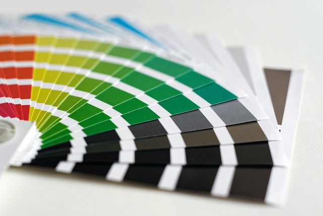
Some examples of neon palettes include; Neon Pink, Electric Green, Cyber Yellow, and Radiant Orange.
They are ideal for use in high-energy fitness spaces, and urban-inspired streets are great ways to leverage this trend.
2. Maximalist Jewel Tones
Deep, luxurious jewel tones like emerald green, sapphire blue, and ruby red are being amplified for maximalist aesthetics.
These colors are rich and dramatic, perfect for creating an atmosphere of opulence and grandeur.
Examples of these bold color palettes include; Deep Sapphire, Regal Ruby, Lush Emerald, and Gilded Gold.
They are great fit for Interior design (accent walls, upholstery), luxury brand buildings and restaurants.
3. Warm Sunset Gradients
Inspired by natural phenomena, sunset-inspired gradients featuring hues like fiery orange, soft pink, and deep purple are trending.
These bold color palettes are perfect for creating a sense of warmth and nostalgia while remaining vibrant and contemporary.
Examples include Fiery Orange, Peach Pink, Magenta Purple, and Midnight Blue.
4. Retro Futurism: Bold Pastels
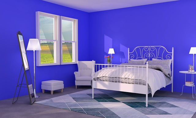
Retro-futuristic palettes merge nostalgia with innovation, blending soft pastels with bold, contrasting accents.
Think powdery blues paired with zesty oranges or lavender juxtaposed with vivid chartreuse.
Examples of these palettes include Powder Blue, Bright Chartreuse, Vivid Tangerine, and Lavender Mist.
They are a great fit for technology hubs, product packaging warehouses, and event centers design.
5. Earthy Yet Bold
Earth-inspired palettes are embracing bolder interpretations of natural hues.
Terracotta, mustard yellow, forest green, and clay reds are becoming more vibrant while maintaining their organic feel.
This balance between roundedness and vibrancy is perfect for eco-conscious designs.
The typical examples of these bold color palettes are Vibrant Terracotta, Golden Mustard, Bold Forest Green, and Rich Clay Red.
They are a sustainable fit for bohemian interior design, and artisanal product packaging warehouses.
Why Bold Color Palettes Are Gaining Popularity in 2025
1. A Push for Individuality
As people and brands strive to stand out in a crowded decoration landscape, bold colors offer a way to differentiate and make a statement.
Bright and daring palettes help break through visual clutter, especially on immediate identification.
2. Emotional Impact
Bold colors evoke strong emotions and can be used strategically to influence perceptions.
For example, warm tones like orange and red create energy and urgency, while cooler hues like blue and green convey trust and tranquility.
3. Cultural Influences and Global Design Trends
The rise of global influences in interior design such as Moroccan, Indian, and Latin American styles, brings bold, saturated hues to the forefront.
Interiors now celebrate culturally rich palettes, mixing vibrant reds, oranges, and blues with intricate patterns and textures.
4. Inspiration from Technology and Nature
The juxtaposition of futuristic and natural inspirations is shaping color trends.
Decoration designers are looking to both the physical aesthetics and the natural world (sunsets, forests, and oceans) to create dynamic palettes that resonate with clients.
5. Post-Pandemic Desire for Optimism
Following the global pandemic, people crave uplifting, happy environments.
Bold and bright colors, such as sunny yellows, lush greens, and vibrant blues, evoke feelings of positivity and energy.
These palettes make interiors feel optimistic and invigorating, reflecting a desire for joy in everyday life.
6. Advances in Paint and Material Technology
Advances in pigment and paint technology allow for richer, more vibrant colors that maintain their depth and durability.
Decoration designers are also experimenting with innovative materials in bold hues, such as brightly colored ceramics, metals, and textiles.
Bold color palettes are becoming more accessible and practical for everyday use.
7. Embracing Boldness in Small Spaces
Instead of trying to make small spaces appear larger with light tones, designers are embracing bold colors to create depth and drama.
For instance, a deep navy bathroom or a vibrant red kitchen can make a memorable statement.
Bold color palettes are proving that small spaces can be big on style.
How to Incorporate Bold Colors Into Your Decoration Design Projects
1. Start Small with Accents
If you’re hesitant about using bold color palettes, start by incorporating them in small accents rather than committing to large surfaces.
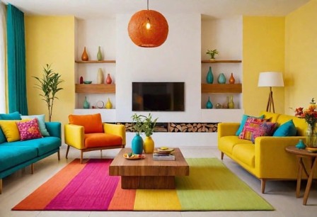
Accessories such as throw pillows, rugs, vases, or artwork are excellent ways to introduce vibrancy without overwhelming your space.
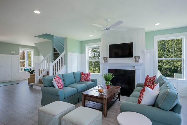
For example, in a neutral living room, adding a bright orange rug or a cobalt blue vase can inject energy while still maintaining balance.
These elements are also easy to swap out if you decide to experiment with different shades over time.
2. Make a Statement with a Focal Point
Bold colors work best when you give them spotlight in your space.
Choose one key element, like a brightly colored sofa, a statement wall, or a piece of oversized artwork, to serve as your room’s focal point.
For instance, a deep emerald green couch in your living room can create a sophisticated anchor, complemented by muted tones and textures around it.
This approach prevents the bold color from overpowering the room while still drawing the eye.
3. Pair Bold Colors with Neutrals
Bold hues can shine more effectively when balanced with neutral tones such as white, gray, or beige.
Neutrals create a calming backdrop that allows vibrant shades to pop without feeling too chaotic.
A crimson red accent chair, for example, can be paired with light gray walls and a white coffee table to achieve a striking yet harmonious look.
This method is especially helpful if you want to add bold colors in a way that feels polished and timeless.
4. Layer Colors with Textures and Patterns
Combining bold colors with different textures and patterns can create a visually interesting and dynamic space.
Velvet, leather, and woven fabrics in saturated hues add depth, while patterned elements like striped rugs, geometric curtains, or floral cushions can make your room feel cohesive and lively.
For instance, pairing a bold teal velvet couch with a patterned mustard yellow throw blanket can create a sense of richness and warmth.
5. Experiment with Bold Walls or Ceilings
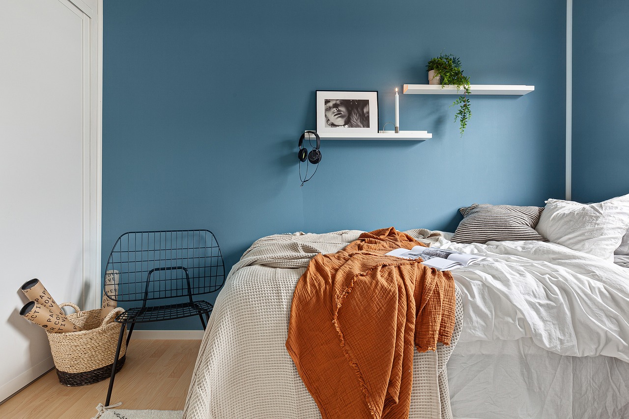
Painting an accent wall or ceiling in a bold color is a daring yet effective way to transform your room.
For example, a bright coral wall in your dining area or a navy blue ceiling in your bedroom can add drama and character.
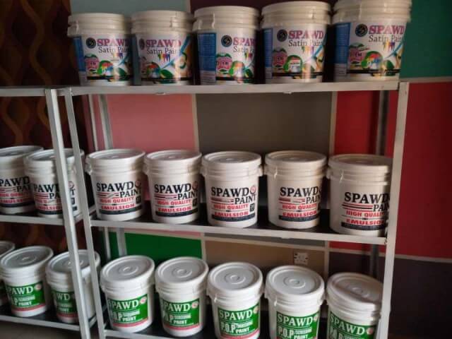
When using bold paint, balance it with softer or neutral furnishings to prevent the room from feeling too heavy.
If you’re unsure, opt for just one wall or a small area to experiment with the effect.
6. Use Bold Colors in Unexpected Places
Adding bold colors to unexpected areas can make a space feel creative and unique.
For instance, painting the inside of your bookshelf in a vibrant fuchsia or adding a pop of color to the backs of chairs or cabinet interiors creates a fun surprise element.
These subtle touches can elevate your design without requiring a full room transformation, making it ideal if you want to incorporate bold colors more playfully.
7. Choose a Monochromatic Bold Palette
If you love a specific bold color, consider using it in a monochromatic scheme throughout the room.
By layering various shades, tones, and textures of a single color, you can create a cohesive and dramatic look without overwhelming the senses.
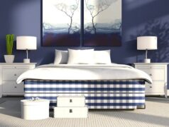
For example, a bedroom designed in varying shades of navy blue—from the walls to the bedding to the curtains, feels both bold and sophisticated.
This approach allows you to embrace boldness while maintaining harmony within your space.
The Future of Bold Colors Beyond 2025
The rise of bold color palettes in 2025 signals a shift towards fearless expression and innovation in design.
As technology evolves and sustainability becomes more integral to design thinking, we may see bold colors being used in even more experimental ways, such as interactive lighting, dynamic textiles, and AI-driven design solutions.
Ultimately, the continued exploration of bold colors will redefine how we communicate and connect with the world around us, making them a timeless yet ever-evolving element of creative expression.
Conclusion
In 2025, bold colors aren’t just a trend, they’re a movement.
By embracing daring hues and experimenting with unconventional combinations, you can create designs that are not only visually stunning but also deeply resonant.
So go ahead, unleash your creativity, and make 2025 the year of bold color brilliance!
